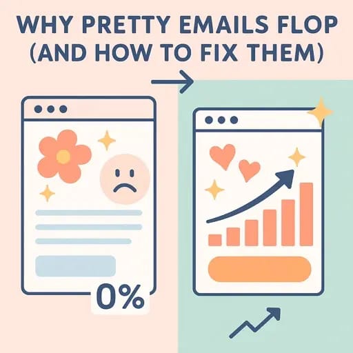
📨 Your Emails Are Gorgeous. So Why Don’t They Convert?

A design-fluent take on why pretty emails sometimes flop—and what to do about it.
“It’s not you. It’s your email’s energy.”
That sounds like something a tarot reader might say at a vegan brunch in Portland, but stick with me 🥑✨
Because this is the line I wish someone had whispered to Daniel Rivera last Tuesday night, after he hit send on a stunning email… and got nothing but crickets.
Zero replies.
5% open rate.
A unsubscribe from a name he actually liked.
Sound familiar?
Let me tell you a story...
The Invisible Art of Emotional Conversion 🎯
Back when I was ghostwriting for a well-known creative (you’ve definitely liked one of her carousels), we had a rule:
“Design gets you seen. Emotion gets you saved.”
That campaign? It looked like an indie magazine layout. It felt like a love letter.
No countdown timers. No “boost your biz” clichés.
Just one question in the P.S. line:
“Does this feel like something you’ve been quietly needing?”
Over 300 replies.
And a 42% click-through rate. (Not a typo.)
The secret wasn’t “great copy.”
It was emotional clarity.
And that’s where most beautiful emails fail.
Why Great Design Can Hurt Conversion (If You’re Not Careful)
Here’s the harsh truth, friend:
💡 Just because your email is beautiful…
💤 Doesn’t mean it’s memorable.
Let’s break it down 👇
The Future of the Content Economy
beehiiv started with newsletters. Now, they’re reimagining the entire content economy.
On November 13, beehiiv’s biggest updates ever are dropping at the Winter Release Event.
For the people shaping the next generation of content, community, and media, this is an event you won’t want to miss.
✖️ The 3 “Too Goods” That Hurt You
Too polished: It looks like a brand, not a person. No soul = no scroll.
Too clever: That poetic subject line? It went right over their heads.
Too symmetrical: Predictability in layout can lull people into skimming autopilot.
And when Daniel pours 3 hours into typography and zero into emotional pacing, he’s crafting eye candy… not email intimacy.
So what’s the fix?
The 5-Point "Design-to-Conversion" Framework 🎨🧠
Here’s the framework I use with clients (and myself) when their emails are too quiet to be ignored:
1. Start with a pulse, not a point
Don’t open with what you want to say.
Open with what they’re already feeling.
✅ Instead of: “Here’s what I launched…”
🧠 Try: “Ever feel like your best work gets the least attention?”
2. Break the scroll with contrast
Your email should feel like an emotional moodboard:
Soft visuals + sharp questions
Bold headers + vulnerable anecdotes
White space + one vivid metaphor
Daniel’s vibe is minimalist. Cool.
But sometimes? He needs a spark. A jolt. A single sentence that screams in italics.
3. Add a "mirror moment" halfway through
That line where the reader thinks: “Whoa. That’s me.”
Use one of these trigger formats:
“You probably…”
“Maybe you’ve sent…”
“And yet, no one replied…”
This builds intimacy and trust fast.
4. Offer resonance before resolution
Before you offer a CTA or idea, show that you see them.
📩 Example:
“If you’ve been designing alone in a coffee shop wondering why nobody clicks… this next part is for you.”
Then give the strategy, tool, or insight.
5. Close with emotional lift—not CTA guilt
No “hurry or you’ll miss out.”
End on a permission slip, a soulful shift, or a hopeful nudge.
“You’re not broken. Your email just needs more breath.”
Daniel doesn’t need urgency. He needs resonance.
The Big Lesson 💡
If your emails look like art but land like ads, your readers won’t feel moved.
Design is your hook.
Emotion is your conversion engine.
Start crafting emails that feel human, not just high-end.
And the proverb?
“It’s not the prettiest email that wins. It’s the one that speaks.”
🧠 The Invisible Art of Emotional Conversion
How to make your emails feel like they were written just for them.
Design is what they see. Emotion is what they remember.
Read that again.
Because it's the difference between being saved…
…or being swiped away like a bad Tinder date 😬
You can have the most gorgeous layout, pixel-perfect hierarchy, and even a cheeky GIF of a Shiba Inu holding a coffee.
But if your email doesn’t feel anything?
It won’t do anything.
Let me show you what I mean…
Daniel's Ghost Email 🪞📭
Picture this.
Daniel Rivera, our emotionally intuitive, plant-loving brand strategist, sits down in his Portland studio. His morning pour-over is just right. Lo-fi beats are playing softly. And he's finally hit flow.
He designs the perfect email:
Tight spacing 🧩
Dreamy gradients 🌄
A sprinkle of italics for emphasis 🎯
He even writes a “gentle nudge” CTA. (Because hard sells? Ew.)
He hits send.
And then… nothing.
No replies. No clicks.
Just a haunting feeling that somehow, the email didn’t connect.
Daniel’s email looked beautiful.
But it didn’t feel like anything to the reader.
That’s what I call a ghost email:
👻 Seen. But not felt.
Why Most Pretty Emails Don’t Convert 😬
Let’s not sugarcoat it.
Most creators skip emotional writing because:
“It takes too long”
“I’m not a therapist”
“I want to sound pro, not personal”
But guess what?
Emotion isn’t “soft.” It’s strategic.
Here’s why:
Emotion is the decision driver
Before logic, people feel.
They don’t think: “Is this a good offer?”
They feel: “This gets me.”
Emotion builds safety and resonance
Daniel’s subscribers aren’t bots.
They’re humans with inbox fatigue, big dreams, and snack cravings.
If your email feels like a friend—not a pitch—it gets read.
Emotion fuels action
People don’t click because you told them to.
They click because you stirred something in them.
The Emotional Conversion Blueprint 🔧💌
Here’s the 4-part invisible structure behind every high-converting, soul-speaking email:
1. The Mirror Opener
Start with a line that reflects exactly what your reader is feeling.
“You ever write something you're proud of… and it lands like a whisper in a storm?”
It says: You’re not alone.
2. The Vulnerable Reveal
Share something true—not filtered, not flexy.
A doubt you had
A mistake you made
A moment that cracked you open
Real = relatable.
Relatable = remembered.
3. The Gentle Flip
Now guide them gently toward a new belief or insight.
“What if your email isn’t underperforming… it’s just emotionally quiet?”
This is the spark that shifts perspective.
4. The Aligned Invite
Finally, invite them—not push them—to act.
“If you want your next email to feel more like a hug and less like a billboard… here’s what I’d do.”
You’re not selling.
You’re showing them a path they already want to walk.
Emotional Anchors You Can Steal Today 🔗
Use these lines in your next email and watch what happens:
“I almost didn’t send this…”
“You ever feel like…”
“This might not be for everyone, but…”
“Here’s what no one tells you about…”
“Honestly? This scared me.”
“When I hit publish, my hands were shaking.”
Each one opens a door to emotional connection.
Use sparingly. Use sincerely. Use like you mean it.
The Big Lesson 💡
The emails people save aren’t always the ones with the best tips.
They’re the ones that see them.
The ones that say, “You're not broken.”
The ones that land like a voice memo from a wise friend.
That’s the real art of emotional conversion.
The Proverb 📜
“Design gets you seen. Emotion gets you saved.”
💬 What Next?
Try this:
Before your next email send, ask yourself:
“Does this feel like I’m writing to someone… or at them?”
Then tweak it. Make it warmer. Softer. More you.
And when you do?
They won’t just click.
They’ll feel seen.
🔁 Let’s keep the conversation alive:
❤️ Save this for when you write next.
📩 Forward it to the friend who designs too much and emotes too little.
💬 Or reply: What's your go-to line when you're trying to connect in an email?
#EmailDesign #EmotionalMarketing #NewsletterTips #CopywritingForCreators #SolopreneurLife #DesignToConvert #InboxConnection #AuthenticMarketing #EmailByDesign #ElliotSageVoice
📧 Subject Line Ideas (Throssell-style flair)
1. I know why your emails aren’t working (and it’s not the font)
Pre-header: What if beauty isn’t the problem—but emotional distance is?
2. The part of your email no one talks about—but everyone feels
Pre-header: Your layout is fine. Let’s talk about the vibe.
3. How to get replies from people who ghost you
Pre-header: Your words aren’t bad. They’re just not felt.
Join the future of list building using AI to do all the heavy lifting

Meet AI Scale Stack—an opinionated system that helps solopreneurs ship more, sell more, and save 10+ hours a week.
Load a workflow, follow the checklist, and turn one idea into a newsletter, three posts, and a clear CTA—without tool overload. Ready for momentum?


